Ever wondered if green and purple can actually work together? It’s a question a lot of people ask! This guide will show you exactly how to make these two colors look amazing together, whether you’re decorating your home, designing a logo, or even picking out an outfit. We’ll cover everything from understanding the basics of color theory to giving you real-world examples and tips to avoid any design disasters. For even more color inspiration, check out these amazing nail colors. Get ready to unlock the surprising potential of this vibrant color combo!
Unveiling the Secrets of Purple and Green Color Combinations: A Comprehensive Guide
So, you’re wondering if purple and green are a match made in design heaven? The short answer is a resounding yes—but it’s more nuanced than that! These two colors, seemingly opposite, actually create a surprisingly dynamic and versatile pairing. Let’s explore how to make this duo work its magic for you, while avoiding common color scheme mistakes.
Understanding the Color Wheel: Discovering Harmony
Imagine a color wheel: a circular chart showing how colors relate to each other. Purple and green aren’t directly opposite each other, however they have a unique relationship. Green often evokes feelings of nature, peace, and tranquility, while purple brings a touch of royalty, mystery, and even a bit of drama. This interplay creates visual energy and keeps things exciting! This duality can be the key to powerful design.
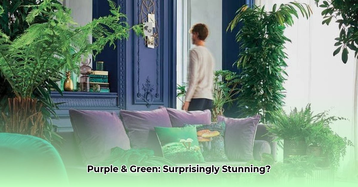
Beyond Basic Green and Purple: A Rainbow of Possibilities for Interior Design and Fashion
Don’t stop at just “green” and “purple.” Explore the vast range of shades within each. Imagine pairing the calming, earthy tones of sage green with the soft, romantic hues of lavender, or the rich, jewel-toned emerald green next to the deep, mysterious plum. The combinations are practically endless! A bright, zesty lime green with a vibrant violet creates a completely different feel than a muted olive green paired with a dusty mauve. Consider the mood you want to set!
Here’s a glimpse at some popular combinations:
| Green Shade | Purple Shade | Feeling/Application |
|---|---|---|
| Sage Green | Lavender | Relaxed, romantic, spa-like |
| Emerald Green | Plum | Luxurious, sophisticated, evening wear |
| Lime Green | Violet | Energetic, playful, youthful |
| Olive Green | Mauve | Earthy, comforting, homey |
| Forest Green | Amethyst | Mysterious, elegant, regal |
Finding Balance: The Key to a Harmonious Blend
Will purple and green always work harmoniously? Not necessarily. While their contrast is appealing, mastering the balance is crucial. Think of it like a recipe: you need the right proportions to achieve the perfect flavor. Using neutral colors like creamy whites, soft grays, or warm beiges can soften the intensity. These act as a bridge, smoothing the transition between the two bold colors. You could also use analogous colors – colors that sit next to each other on the color wheel, such as blues and greens or purples and pinks, creating a softer, more subtle effect. This balance can dramatically impact the overall aesthetic.
Putting It All Together: Real-World Examples
The beauty of this color combo is its adaptability. Let’s look at how it shines in different areas:
-
Branding: Imagine a tech company using a sophisticated teal green alongside a royal purple to communicate innovation and trust. Or, a spa might employ softer, more calming shades to promote relaxation.
-
Interior Design: Picture a living room with deep purple accents against a calming green wall, or a bedroom with muted green walls and purple textiles. The key is to avoid an overwhelming effect.
-
Fashion: A simple green dress paired with a bold purple scarf can make a statement! Or, consider a purple accessory lifting a simple green outfit.
Avoiding the Color Clash: Common Pitfalls
Even the best color combinations can fall flat if not handled carefully. Overusing bright, highly saturated greens and purples can easily create a jarring effect. Mixing too many disparate shades can lead to visual chaos. The solution? Focus on creating a visual anchor or focal point. Let one color dominate, using the other as an accent. Use neutral colors to temper the boldness, or stick to a few shades within a similar tonal range. A carefully chosen neutral can increase the perceived harmony.
Experiment, Learn, and Create! Unleash Your Creativity
Ultimately, whether purple and green work together depends entirely on your vision and how you choose to harmonize them. The possibilities are vast. Don’t be afraid to play around with different shades, experiment with balance, and trust your instincts. The world of color is your canvas; go forth and create!
How to Balance Green and Purple Color Schemes in Design Projects: Step-by-Step
Key Takeaways:
- Purple and green create a visually striking and often harmonious combination.
- Successful pairings rely heavily on strategic shade selection and balancing techniques.
- The versatility of this pairing makes it suitable for various design applications, including fashion, interior design, and branding.
- Understanding the psychological impact of these colors—luxury and serenity, tradition and modernity—is crucial for achieving the intended effect.
Understanding the Color Wheel and Color Psychology: Decoding Visual Language
Let’s start with the basics. Green often evokes feelings of nature, calmness, and freshness, while purple projects luxury, royalty, and creativity. How can we blend these contrasting vibes effectively in visual communication?
Exploring Shades and Variations: Diving into Color Depth
The key to success lies in choosing the right shades. Think of the vast spectrum within each hue: from the deep richness of plum and eggplant to the bright cheer of lavender; from the vibrant emerald to the muted olive green. Darker shades create a bolder look, while paler ones feel softer. Experiment!
| Green Shade | Purple Shade | Overall Feeling |
|---|---|---|
| Emerald Green | Lavender | Vibrant, youthful |
| Olive Green | Plum | Sophisticated, earthy |
| Teal | Amethyst | Calming, luxurious |
| Sage Green | Lilac | Serene, peaceful |
Balancing Act: Techniques for Harmony
How to balance green and purple color schemes in design projects is about creating visual equilibrium. Here’s how:
- Introduce Neutrals: Beige, gray, or cream act as a buffer, toning down the intensity of both green and purple.
- Analogous Colors: Explore colors adjacent to green and purple on the color wheel (e.g., blue-green and blue-purple). These create a more unified palette.
- Varying Saturation: Mix high-saturation shades with more muted tones to prevent visual overload.
Practical Applications: Green and Purple in Action
Let’s look at how this works in real-world scenarios:
-
Branding: A logo might feature a deep green leaf subtly intertwined with a purple flower, creating a memorable and balanced image.
-
Interior Design: A living room with olive green walls could incorporate plum-colored accents—throw pillows, curtains, or artwork—for a touch of sophistication.
-
Fashion: A teal dress paired with amethyst jewelry creates an elegant and unexpected style statement.
Potential Pitfalls and Solutions: Avoiding Common Mistakes
Avoid harsh contrasts between bright, saturated shades of both colors, as they can feel jarring. Overusing either color can also be overwhelming. Remember balance and always test your combinations!
Experiment and Refine: Master Green and Purple
The beauty of design is the exploration. Don’t be afraid to test different combinations of green and purple in your projects and refine initial ideas through experimentation.
Green and Purple in Healthcare Branding: A Holistic Approach to Visual Identity
Key Takeaways:
- Color psychology significantly impacts purchasing decisions in healthcare.
- Green and purple can create harmonious and effective branding when used thoughtfully.
- Successful healthcare branding requires a nuanced understanding of color, moving beyond simple associations.
- Customization based on brand identity and target audience is crucial.
- Careful selection of hues and shades within the green and purple families is essential.
Understanding the Color Dynamic: Exploring Psychological Impact
Can green and purple coexist harmoniously in healthcare branding? Yes, but it requires a strategic approach. Like blending different flavors, some combinations work better than others.

- Stainless Steel Food Storage for Healthier, Eco-Friendly Meal Prep - February 27, 2026
- Stainless Food Containers Offer Durable Storage for Everyday Meals - February 26, 2026
- Stainless Steel Containers Offer Superior Food Preservation and Durability - February 25, 2026